After the last few days of having no idea come to me at all about a possible business. I was starting to worry about what I was going to persent on tuesday. Then last night I went out for a meal for a friends birthday. The topic of university came up, discussing how it would be great to have a online community of students doing the same course as you all around the country. They could help you with problems when you get stuck. This made me start thinking, I-dat has a lot of students and we have our own focus group in a way. But not everyone has that many people on the course. Who do they turn to when there stuck? who do they bounce ideas off? This is where my business idea came from.
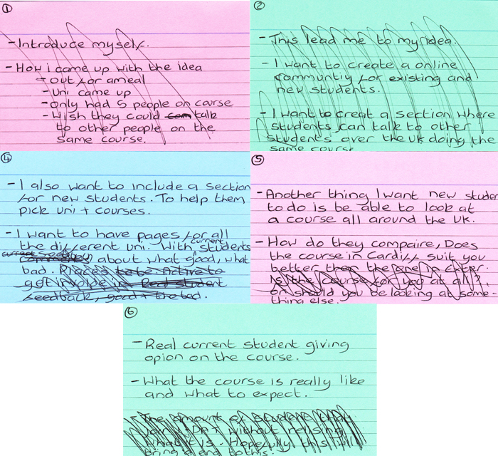
- A online community of students based all around the UK.
- You will be able to take to other students doing the same course as you.
- Most courses cover similar topic, which allows you to discuss problems with people who understand.
- You have a focus of like minded people at your disposable.
- You get to connect with people with the same interests. Be able to share resources (books, blogs) and information about events. That other you might never have heard about.
- Another use for this site is for new student to decide what university they want to do the course at and weather or not the course is really for them, with real student reviews.
- There could be different profiles for the different university showing what they offer and the surrounding city offers.
- There could even be a reward scheme for students who take part in this they collect points and when they get so many points they can buy stuff from the stop.
So one thing I was asking myself how would I make any money? Then I thought about business that are free to sign up to but still make money, like Facebook, Goggle and MySpace. I could have ads on my page, even local ad to where the university is.
I have no idea if this idea has been done before. I have never heard of anything similar, so if it has it clearly has not become very big. But is there a reason for that? I have to undergo a lot of research before the presentation on tuesday. But so far I think the idea could work.


.jpeg)
.jpeg)


